Oppo Joy Review: Not So Joyous After All | TechTree.com
Oppo Joy Review: Not So Joyous After All
Inconsistent performance and an almost useless camera turn out to be a deal-breaker

Sleek Design; Sturdy Construction.
Pathetic fixed-focus camera; Sluggish UI; Paltry internal storage.
Oppo Joy
Street Price: Rs 8000
After announcing high-end devices, Oppo is planning to win some market share with its budget smartphone called Joy. Priced at Rs 8000, the handset mainly competes with the Moto E and Lumia 525. There’s no doubt that selling this phone in the presence of these top-tier brands is definitely going to be quite a task for Oppo. Still, let’s see if it stands any chance against such tough competition.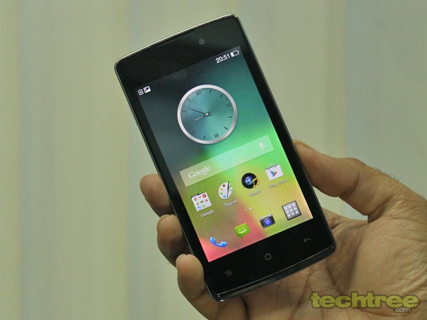
Design And Build
The Oppo Joy is one of the sleekest handset in its class. On the front, you get the edge-to-edge glass, which gives it a premium touch. The phone stands out with its clean design. The back-cover’s construction is very good. Its curved back fits comfortably in the palm. Although it’s made of plastic, the phone feels quite sturdy.
Removing the back-panel is quite a task. But then, that’s something you don’t do every day. The only thing that looks out of place here is the metallic rim around the bezel. I also feel that the bezel could have been smaller.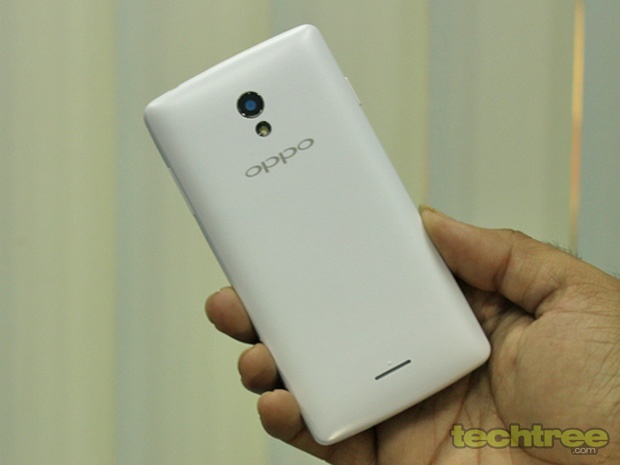
The capacitive navigation keys under the screen lack the capacitive buttons, which becomes a problem when using the device in the dark. The Lock button is placed on the left side, whereas the Volume rocker sits bang opposite. The Lock button should have been on the right side since it would have been easier to unlock the phone with a thumb. On the bright side, the buttons offer good travel and tactile feedback.
Overall, Oppo has done a very good job as long as the aesthetics and build quality are concerned. Another thing worth mentioning here is that the quality of accessories such as the charger and earphones are better than what most Chinese brands offer.
Display
The Joy sports a 4-inch TFT LCD screen. Packing in 400x800 pixels, it’s not very sharp, but then you’re getting what you pay for. What concerns me here is that the colours look washed out. It becomes more apparent when placed alongside the similarly priced Moto E. The brightness levels are just about ok. The viewing angles aren’t very good either. All is not lost though, as the phone features super sensitive screen, which you generally don’t get in the budget Android smartphones.
Specifications
The handset is powered by dual-core MediaTek processor clocked at 1.3 GHz. To handle gaming, it has a Mali 400 GPU. Other specs include a 512 MB RAM, microSD card slot, 3 megapixel camera, VGA front-facing camera for video calling, and 1700 mAh battery. The phone comes with 4 GB internal storage. Out of which, only 1.5 GB is user accessible.
Software
The joy ships the Joy with Android Jelly Bean 4.2.2. That’s obviously dated compared to Moto E’s 4.4.2 Kitkat. Oppo has also made a few changes to the UI. Especially, the interface in native apps such as calendar and contacts is very similar to what we get in HTC’s Sense. That’s not all, the icons look identical to LG's old Optimus phones.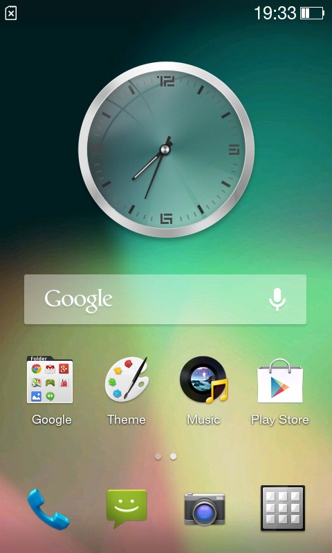

Initially, the phone runs quite smooth. Install a bunch of apps though, and it becomes sluggish. It’s mostly noticeable while you’re downloading something in the background. That’s clearly due to the 512 MB RAM, but the lack of software optimisation plays an equal part here. For number junkies, here are the synthetic benchmark scores.
AnTuTu: 11,347
Quadrant: 3474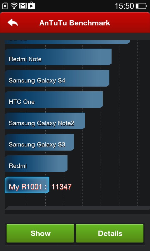
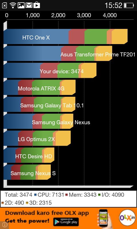
To put things in perspective, the Joy’s closest competitor, Moto E clocks in 12,412 in AnTuTu and 5214 in Quadrant.
Multimedia And Camera
Considering the phone's price tag, the Joy offers good sound output. The music player offers a few fancy features such as 'shake to skip'. By default, the phone doesn’t support many formats. However, as you'd already know, a third-party video player helps you overcome this issue.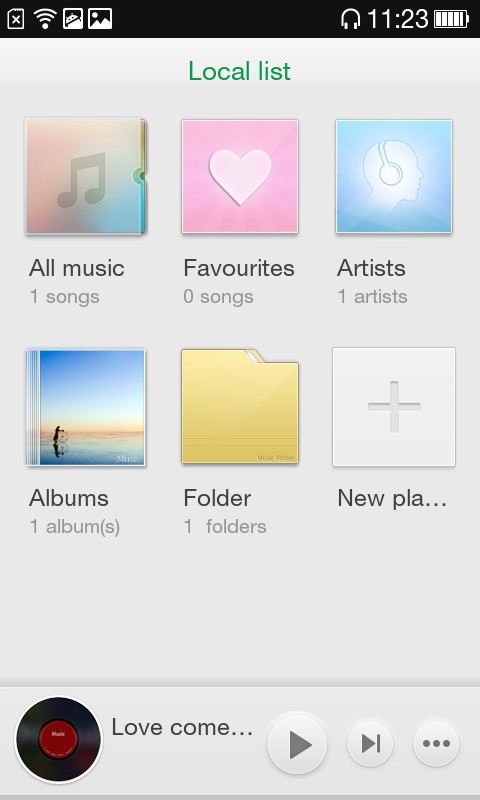

The phone comes with a 3 megapixel fixed-focus camera that offers face detection and burst modes. The image quality is absolutely horrendous. If you're planning to use the phone's camera, do not buy this handset.
Telephony And Messaging
The Joy comes with one microSIM and one normal SIM slot. Like any other dual-SIM (GSM) phone, the phone features proper SIM management menu. After using it for a week, I found no issues with the handset's network reception or call quality. The on-screen keyboard layout is quite neat. Moreover, it’s responsive and supports Swype feature out-of-the-box.
Battery Life
The phone packs in a 1700 mAh battery that easily lasts for more than a day and half. Unless you use 3G a lot. In our video loop test, it managed to power the device for almost 6 hours. That’s pretty average for a budget Android device.
Verdict
The Oppo Joy is one sleek looking handset with sturdy build. This Chinese company is not to be taken lightly in terms of aesthetics. We were quite pleased with its sound quality too. However, the inconsistent performance and an almost useless camera turn out to be a deal-breaker. To make the matters worse, the Moto E offers a better screen and performance at the similar price tag. So if you’re planning to buy a budged Android smartphone under 10k, the Moto E is still your best bet.
Features: 3/5
Design and Build Quality: 3.5/5
Performance: 2/5
Value For Money: 2.5/5
Mojo: 2.5/5
Overall Rating: 2.5/5
TAGS: Mobile Phones, Android, Oppo
- DRIFE Begins Operations in Namma Bengaluru
- Sevenaire launches ‘NEPTUNE’ – 24W Portable Speaker with RGB LED Lights
- Inbase launches ‘Urban Q1 Pro’ TWS Earbuds with Smart Touch control in India
- Airtel announces Rs 6000 cashback on purchase of smartphones from leading brands
- 78% of Indians are saving to spend during the festive season and 72% will splurge on gadgets & electronics
- 5 Tips For Buying A TV This Festive Season
- Facebook launches its largest creator education program in India
- 5 educational tech toys for young and aspiring engineers
- Mid-range smartphones emerge as customer favourites this festive season, reveals Amazon survey
- COLORFUL Launches Onebot M24A1 AIO PC for Professionals


TECHTREE