Review: Gionee Elife E6 — A Promising New Kid On The Block | TechTree.com
Review: Gionee Elife E6 — A Promising New Kid On The Block
Looking for a phone with GALAXY S4-like features at almost half the price? Check this out.

Excellent Full HD Display; Good build quality; Impressive hardware; 2 GB RAM; Ample internal storage; Good 13 MP camera for those with steady hands; Neat front camera; Gesture controls that actually work.
Gionee’s UI layer makes the phone sluggish; Tries too hard to be an iPhone imposter; Smudge magnet; Camera struggles to focus on objects beyond 10 feet; Speaker volume too low; No expandable memory.
Gionee Elife E6
Street Price: Rs 21,000
Who should buy it?
- If you want a smartphone with a brilliant screen
- If you want a spec-heavy phone that’s elegant and affordable too
- Those looking for a phone with GALAXY S4-like features at almost half the price
- Those willing to put their trust in a product than a brand
Who shouldn’t?
- Those who like/want a pure Android UI
- Those who are brand conscious
- If you are looking for a phone with long battery life
For the past couple of years, the Indian smartphone market has seen an attack of clones. Far too many manufacturers have invaded this space, most claiming to be Indians, but in reality, these are more Chinese than the Chinese food we get here. So when a colleague introduced me to Gionee Elife E6, my first reaction was – not one more, please! But when I had my first glimpse of this handset, it got me curious enough to ask, who’s Gionee.
Now, the good part is that Gionee doesn’t pretend to be Indian, though it does sound a tad Sindhi. They are supposedly the third largest manufacturer of mobile phones in China. And they have decided to get their flagship offering, the Elife E6, to India in the upper mid-range segment that still has some breathing space, unlike the entry-level flea market. So let’s jump straight into the action and see if this handset stands a chance to make a name for itself here.
Design and Build
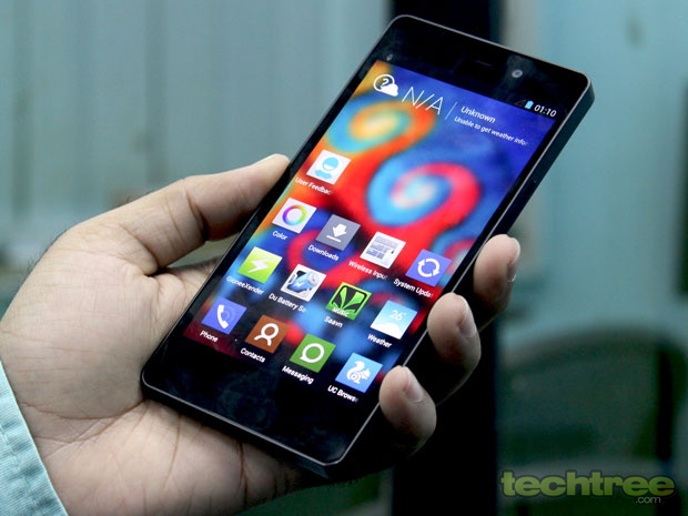
The moment you hold this phone in your hand for the first time, you won’t be blamed for thinking that it belongs to the Sony Xperia series, especially its resemblance to the Xperia Z. This was vindicated by the multiple “Which Sony Xperia is this?” queries that I had to endure during the course of the testing. Some of the design elements have also been borrowed from the iPhone 5, especially the speaker grille at the bottom. But despite the multiple inspirations, I must say that this phone looks fairly elegant with its all glass front and the black matte back. It looks much better than what we have seen from our domestic manufacturers.
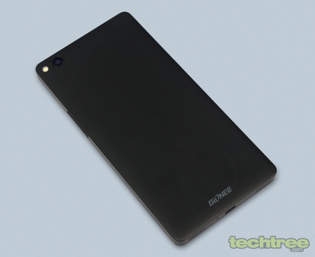
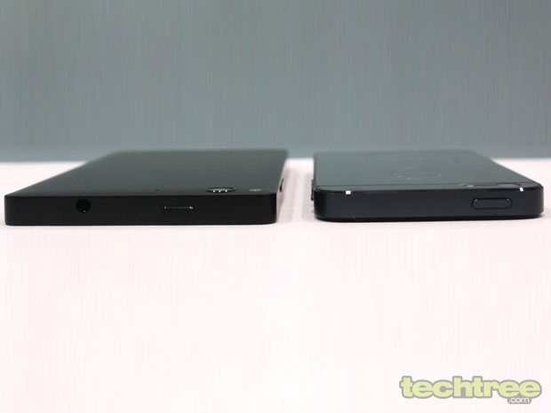
Also, its build and the materials used in its construction are top notch. Not a creak was heard even when I gripped it hard. In fact, I would go to the extent of saying that its overall build quality is way better than that of not just the domestic manufacturers, or its compatriots like ZTE, but also some tier 1 manufacturers like Samsung. It should easily be able to survive a few falls, as long as you don’t drop it on the screen. Incidentally, my review unit seemed to have suffered a fall before it reached my desk, as there was a tiniest of dents just below the screen, if one looked closely. Despite its solid build, the phone is fairly light and just 7.9 mm thin.
The only real complaint I had regarding its construction is that it’s a smudge magnet, and not just on the screen. Yes, you may not find the situation as bad as that of phones with glossy bodies, but despite its matte finish, the smudges are fairly visible. You will see finger prints all over the screen and it needs to be cleaned from time to time.
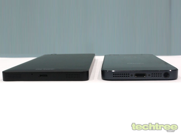
The back panel is non-removable and hence, the battery is not user-replaceable. The Power/Lock button is placed at the top but worry not, you don’t need to stretch your finger all the way there to turn the screen on. The volume down key placed along the right edge can also be used to switch on the display.
Display
The Gionee Elife E6 has a 5-inch Full-HD IPS screen with pixel dimensions of 1080x1920. It has an OGS display, which reduces the space between the screen and the protective glass. This is one of best screens I have come across in smartphones. Though it’s not an AMOLED screen, the colours are absolutely vibrant and the picture quality is brilliant. The sunlight legibility is just above average though. The screen is very responsive and I have nothing to complain about in that department. However, since the side bezels are quite thin, expect a lot of accidental key-presses/touch inputs. It resists scratches thanks to a layer of Gorilla Glass 3 on top. So you need not put a scratch guard and dilute the image quality, though the company has bundled a couple of them in the package.
Hardware
The phone has a Mediatek quad-core processor at its heart, with each core clocked at 1.5 GHz. Graphics and gaming are handled by the PowerVR SGX 544MP GPU, which is more than decent for casual gaming, but expect no miracles in high-end games. There’s 2 GB of RAM to take care of multitasking. The handset doesn’t have a microSD card slot but does come with 32 GB of storage space, of which about 25 GB is user accessible. That should suffice for most of the users but a provision to expand it further would have been nicer.
On the connectivity front, the phone covers almost all the bases. There’s 3G, EDGE, Wi-Fi, Wi-Fi Direct, Bluetooth 4.0, Micro USB, and the works. Detailed specifications can be found here.
Software and User Interface
The phone runs Android Jelly Bean 4.2.1 out of the box with heavy customisation on top. Now this is a part that you would love or hate. Gionee has tried too hard to make the user interface look a lot like iOS7. So much so, that even the Apple’s application removal interface and animation can be found here. Yes, that one where you touch any icon on the screen for a few seconds till all of them get shaky with a small ‘X’ on top. Yes, that! While the best of iOS and Android sounds super-cool at first, in reality it is not. If you are habituated to the standard Android interface, things tend to get irritating after a while when you can’t find certain elements in their usual spots.
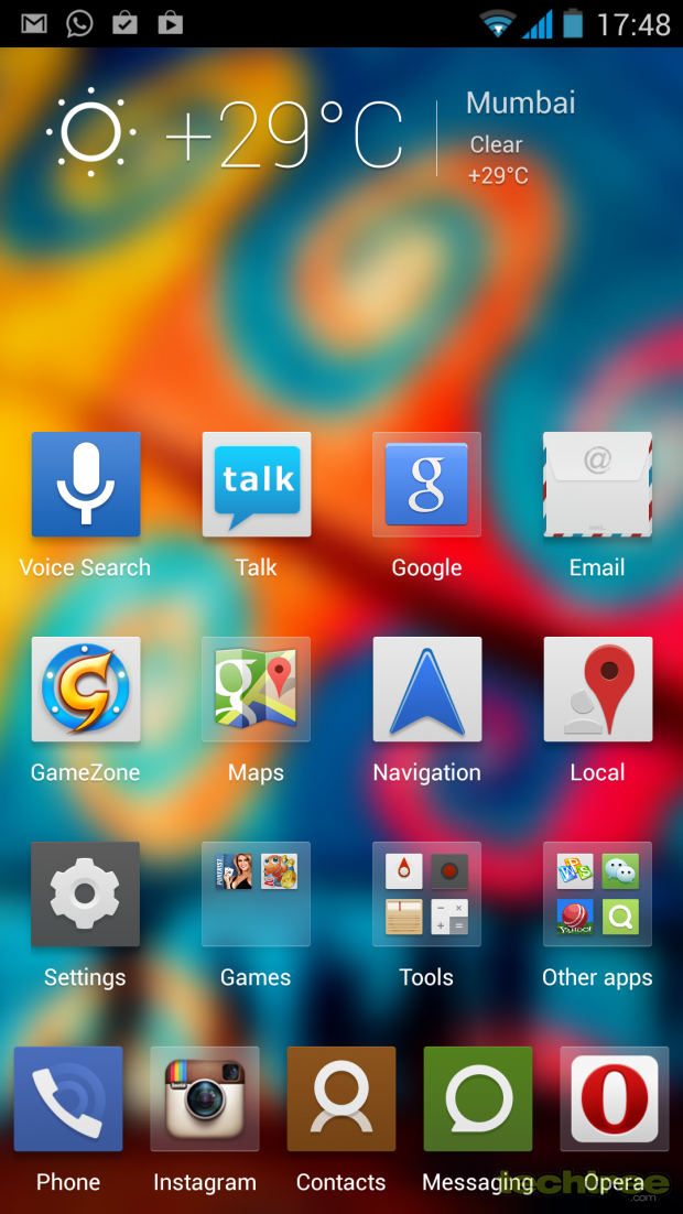

The UI makes extensive use of swipe gestures, starting with Swipe Up to unlock the screen and Swipe Down to lock it. The trouble with the second gesture is that you often end up locking the screen when trying to pull down the notification bar. These are still minor niggles that you can get over. There are two major issues though. Firstly, all this visual jazz makes the interface sluggish despite the quad-core processor and 2 GB RAM. And secondly, there are a lot of pre-installed apps that you just cannot uninstall. An unnecessary wastage of memory, storage space, and screen space too.
I so wish Gionee would have given an option to have a stock Android interface. With its hardware, the phone would have been a lot smoother.
Camera
The Gionee Elife E6 comes equipped with a 13 megapixel rear camera with auto-focus and LED flash. The company claims that there are 5 layers of blue glasses in there. Well, let’s not bother too much about what they do and focus on how the camera performs. If I have to sum up its performance in a word, I would say it’s temperamental. The image quality varies between sharp and grainy, depending upon the lighting conditions and distance of the subject from the camera. Generally, one would assume that the quality would deteriorate in low light, but that’s not the case here. The camera actually performs quite well in low light conditions as compared to other phones in its price range. It does pretty well in well-lit environments too, provided the subject is not too close or too far from it.
But all this goes for a toss if you have shaky hands. The image stabilisation here is below par. I know it’s a phone after all and not a camera, but there’s certain degree of motion compensation that one has come to expect in phones that flaunt a 13 MP sensor and a 20K+ price tag. However, if you can keep your hands steady, the captured shots are really impressive with a great degree of detail and accurate colours. Click on the image samples for the untouched shots.
There’s a touch-to-focus option but the camera just cannot capture enough details in objects that are placed more than 10 feet away, even in well-lit conditions. To sum it up, if you have steady hands, and if you stick to clicking object that are located between 1 to 10 feet from you, the camera on this phone is very impressive. However, if those conditions are not met, the camera is average at best.

OK, What exactly do I focus on?
A special mention for its 5 MP front snapper. Figures like 5 MP for the front camera are often marketing mumbo-jumbo and meant to be taken with a pinch of salt. But the one on this phone is as good a front snapper as I have seen on any Android device thus far. It is a fixed focus camera and touch-to-focus doesn’t work here, but in bright natural lighting, it captures a great amount of detail. In indoor lighting, it doesn’t do too badly either. For those who love selfies, this camera can shoot some real good ones (provided the subject is presentable).
Performance
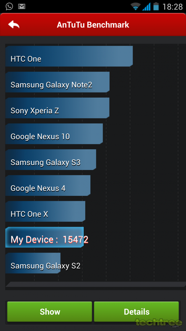
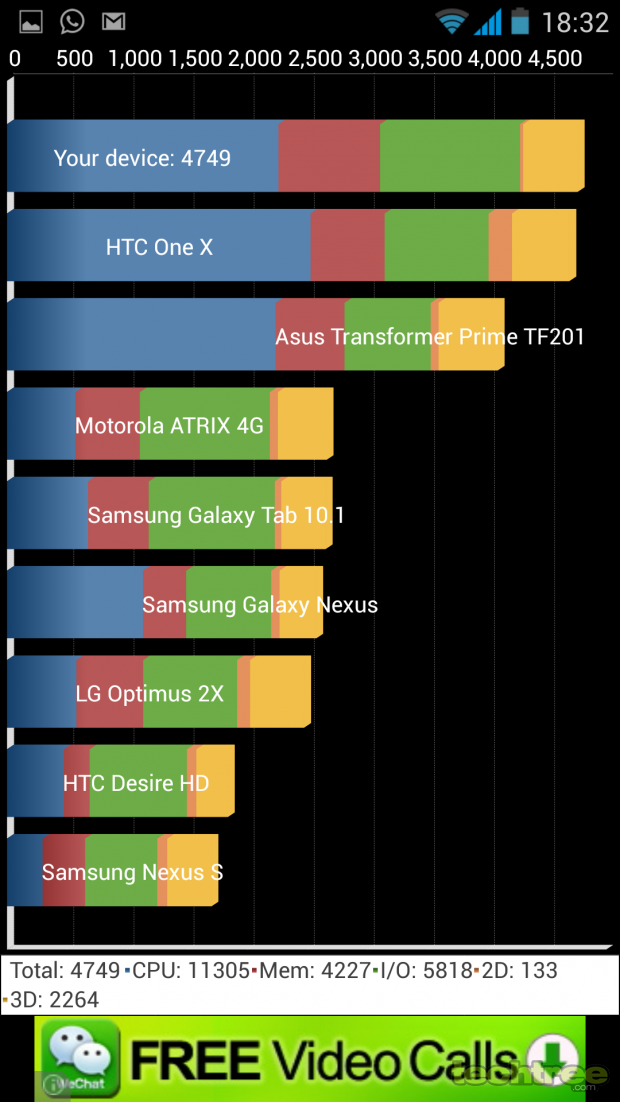
The overall performance of the phone is satisfactory barring a few UI-related hiccups. As I mentioned earlier, Gionee’s UI layer makes the experience a bit laboured, especially when navigating between screens. But apps open pretty fast and aren’t as laggy. The gaming experience is pretty decent too as long as you stick to the casual games such as Angry Birds: Star Wars/Go or Temple Run 2. Games such as Dead Trigger are also playable with the odd frame skipping. But anything more graphics intensive struggles on this device. Real Racing 3 wasn’t zippy enough to be enjoyable. The phone also tends to get warm from time to time, but never reaches alarming levels. For number junkies, check the benchmark scores below.
Talking about its multimedia performance, the video playback is smooth even for HD content. Full HD videos do stutter a bit occasionally but not as much as SRK to be a deal breaker. Anyway, why would you really want to play Full HD content on a 5-inch screen, except for those captured by its camera? When it comes to music, it’s a mixed bag. Though the bundled earphones are in-ear type, the quality is nothing great. The biggest drawback here is the volume level, which isn’t loud enough even at peak volume. This issue can be fixed by using third party earphones. I tried using my Cowon EM1 with this phone and the sound quality was way better than what the bundled set could manage. It was noticeably louder too. However the loudness is just about right only at peak volume when you are outdoor. Another weird part about this device is that the sound fades out when an email arrives and it takes about 10 to 15 seconds to return to the original loudness level. That’s a bit too much respect for an email alert, don’t you think?
This phone supports gesture controls, and believe it or not, they actually work. I have come across several phones this year that boast of this feature, starting with the Samsung GALAXY S4, but it’s always been a ‘hit and miss’ case. In case of the Gionee Elife E6, you can browse through image gallery with a hand gesture, or pause a video when you look away from the screen. Yes, they work here, and better than the way they do/don’t on the GALAXY S4. The only catch is, you need to hold the phone at least a foot away from you for gestures to function properly.
Basic functionality such as calling leaves no scope for complaints. The call quality is excellent. It is loud and clear. No issues there. However, the loudspeaker on this device is quite weak, and you are bound to miss a few calls if the phone is not in the same room as you.
Battery Life
The phone packs in a non-user-replaceable 2000 mAh battery that keeps the phone running for about 30 hours of standard usage, sans heavy gaming. That is if you spend better part of the day connected to a Wi-Fi network and about 4 to 5 hours on EDGE or 3G. For that much data usage on your GSM network, the battery life stays close to 30 hours irrespective of whether you use 3G or a slower data connection. With Wi-Fi off, the phone stays up for about 16 to 18 hours on a 3G network. The battery life can be termed as average. But given that it has a Full HD screen, which needs quite a bit of juice for all those extra pixels, these numbers are acceptable, though not impressive.
Verdict
The Gionee Elife E6 is available for Rs 21,000. At that price, it takes on some of the established players in the upper mid-range segment such as the Google Nexus 4. While the price may seem a bit too ambitious for a lesser known brand in India, it is just about fine for what it offers. A price tag tad under 20K would have been more apt both economically and psychologically.
Should you buy it? It is not a bad option at all if you are willing to trust a new brand. I do not know much about its aftersales service yet but as far as this device goes, it is certainly better than what any of our domestic brands offer in this price bracket or for that matter, the watered-down hardware that some renowned brands throw at you in this budget. The screen is its standout feature by far and is comparable to what some phones twice its cost offer. Other than that, the phone looks stylish and elegant enough to be carried around, if you are afraid of being judged on the basis of the phone you use.
All and all, a pretty decent offering and a good introduction to the brand, Gionee. If you are willing to look beyond the cons that I have mentioned, it is a good handset. Most of the shortcomings aren’t too serious, and if Gionee is listening, these can be fixed with a software update. If brand name matters to you, or if Full HD screen and UI modifications seem nothing more than a gimmick, the Google Nexus 4 would be the perfect alternative for you in this price bracket.
Features: 3.5/5
Design And Build Quality: 4/5
Performance: 4/5
Value For Money: 3/5
Mojo: 3/5
Overall Rating: 3.5/5
- See more at: http://www.techtree.com/content/reviews/3984/review-sony-xperia-z.html#sthash.phwmNuTB.dpufFeatures: 4/5
Design And Build Quality: 3.5/5
Performance: 3.5/5
Value For Money: 4/5
Mojo: 3.5/5
Overall Rating: 3.5/5
TAGS: Mobile Phones, Android, gionee
- DRIFE Begins Operations in Namma Bengaluru
- Sevenaire launches ‘NEPTUNE’ – 24W Portable Speaker with RGB LED Lights
- Inbase launches ‘Urban Q1 Pro’ TWS Earbuds with Smart Touch control in India
- Airtel announces Rs 6000 cashback on purchase of smartphones from leading brands
- 78% of Indians are saving to spend during the festive season and 72% will splurge on gadgets & electronics
- 5 Tips For Buying A TV This Festive Season
- Facebook launches its largest creator education program in India
- 5 educational tech toys for young and aspiring engineers
- Mid-range smartphones emerge as customer favourites this festive season, reveals Amazon survey
- COLORFUL Launches Onebot M24A1 AIO PC for Professionals


TECHTREE