Review: Samsung GALAXY Note 3 | TechTree.com
Review: Samsung GALAXY Note 3
Powerful and packed to the gills with features, but short on elegance.

Brilliant screen; Feature-packed S-Pen; Excellent for gaming; Ideal for watching movies; Great battery life.
Uncomfortable for single-handed use; Feels too plasticky; Boring design; Overwhelming UI; Camera could have been better.
Samsung GALAXY Note 3
Street Price: Rs 45,000
Who should buy:
- Those looking for a big and beautiful screen.
- Folks who want long-battery life.
- Those who love using stylus for taking notes and doodling.
- Those interested in gaming.
Who shouldn’t:
- People who prefer pocket-able phone.
- Those in for a phone with simple and non-cluttered interface.
- Those looking for a premium and stylish phone.
Samsung, the pioneer of "phablets" or "Fonblet" (as the company likes to call it), added a new member to its Note series of handsets. As expected from the Korean giant, things have got bigger and faster for the Note 3. On the launch day, the company overwhelmed the fans with Note 3's 5.7" full-HD AMOLED display, octa-core Exynos chipset (A15 1.9 GHz + A7 1.3 GHz), and 13 megapixel camera. This definitely looks impressive on paper, but does it matter much in real world scenario? Time to find out.
Design And Build
On its face, the Note 3 looks like every other Samsung flagship phone. It's big, plasticky, and has an uninspiring design. As a phone, the Note 3 is one of the most unwieldy thing to lug around after Sony's stupendous Xperia Z Ultra. Personally, it never felt comfortable in my jeans pocket. But then, the phone is meant for rich kids who won't have to put up with public transport.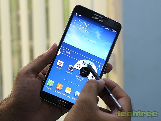
Although the phone looks pretty much like its predecessor, one design change worth noting here is the non-glossy back-panel. The rear now features a faux-leather material. Having seen many Note II's colour being peeled off after a few months, I'd say that the matte finish is a welcome change. However, its texture and stitch-pattern would trigger polarised reactions. For instance, I found it a bit lousy, whereas a friend of mine thinks of it as classy.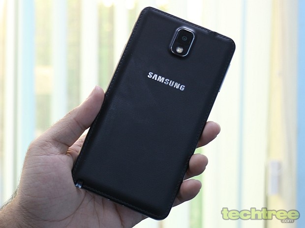
The faux-metal finish on the Note II's sides has been retained. There's a slight change though, as it now features vertical stripes that don't do the aesthetics any good. Overall, the phone fails to deliver a premium feel, which you would expect from Rs 45,000 phone. On the bright side, the phone's build quality is quite sturdy. Apart from the black version (the one we received), the The Note 3 comes in White and Pink.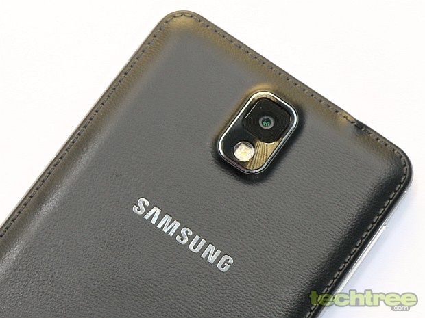
While most Android manufacturers are going with the on-screen navigation keys, Samsung has decided to go with tried and tested combo of home button, and two capacitive keys. That's a sensible decision, as it would make existing GALAXY users feel at home. At 168 grams, it's not that heavy considering the phone has a huge 5.7" screen, and also holds a stylus. Seriously, a few additional grams over a regular smartphone isn't really a problem. The retail package is a standard affair: charger, USB cable, and earphones are what you get.
Display
The Note 3 has a 5.7" Super AMOLED screen with 1080x1920 pixels. That takes the pixel density to 386 ppi, which delivers sharp viewing experience. The colours look vibrant and there's also an option to tone it down as per your needs. Being an AMOLED panel, the blacks are impressive. Although the sunlight legibility is quite ok, there's definitely a room for improvement.
Specs
The Samsung Galaxy Note 3 is powered by an octa-core Exynos chipset (A15 1.9 GHz + A7 1.3 GHz). Now, that’s a lot of power for a smartphone. For multitasking, there's 3 GB of RAM. Then there's 13 megapixel camera with Smart Stabilisation. You can check the detailed specs at the end of the article.
Software
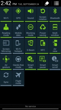
The Note comes with the latest version of Android, that is 4.3 Jelly Bean. However, with Samsung’s TouchWiz layer on top, you won't find much of a difference between the Note 3 and its predecessor. The icons and other design elements still look garish. On default settings, the phone makes a "bloop" sound every time you click something, which is quite annoying. It's a matter of personal taste though, and I can't rule out the possibility that a few people might actually like it. The notification bar has been enhanced to offer more information. Apart from the Wi-Fi, GPS, and Silent mode toggles, you get a brightness slider right there, which comes in handy. On the other hand, Samsung has gone overboard with quick-settings menu. Just because you have a bigger screen, doesn't mean you stuff it with more information than a user can comprehend. It looks extremely cluttered.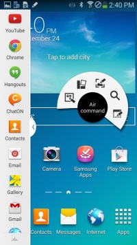
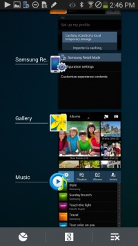
The S Pen (stylus) functionality has greatly improved in the latest iteration of GALAXY Note. Whether you prefer an accessory over a touch of your finger is a matter of personal preference. Clicking the S Pen button while hovering it over the screen brings up Air Command that gives quick access to five features as explained below:
Action Memo
An easy way to take notes, execute a function, or convert handwritten information into formatted content. Action Memo can initiate a call, add to contacts, look up an address on a map, and search the web.
Scrapbook
This feature enables users to organise content and information from various sources including the web and gallery, all in one place. For instance, you can crop and save portion of a webpage or gallery image in scrapbook for future reference.
Screen Write
This feature allows you to take screenshot, and add information onto the captured image.
S Finder
S Finder allows users to search for content on their device. Think of it as the Search feature on your Windows PC.
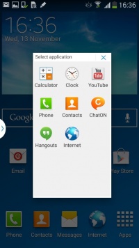
Pen Window
Improving upon the multi-window feature, the Note 3 now allows you draw a custom size window for multitasking.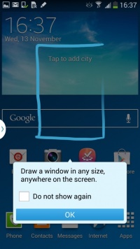
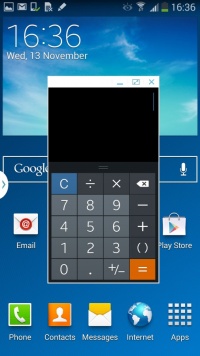
Overall, the Note's stylus integration is very good. The pressure sensing tech works quite well allowing full-control over the writing. It's undoubtedly the best stylus integration you get on a smartphone.
Coming to the subject of performance, there's not much to complain about. At the same time, it isn't spotless either. You can easily catch a slight stutter throughout the phone's interface, it's especially pronounced in the music player. Samsung has been accused of rigging benchmark scores multiple times. But, if you still care for numbers, here's what the Note 3 has to offer — Antutu: 34,303; Quadrant: 20,281. That put it comfortably ahead of the competition, theoretically.
Multimedia
Samsung has kept its tradition of shipping quality IEMs with its high-end phones. More importantly, the device's sound quality is great. Samsung has offered plenty of equaliser settings and sound enhancements to experiment with. As mentioned earlier though, the music player lags a bit, which is quite annoying. Thanks to the brilliant AMOLED screen, the Note 3 is best suited for watching movies on the go. The player supports most of the video codecs out of the box. Be it AVI, MP4, MKV, or even WMV files up to 1080p, the Note 3 will play it without a hitch.
Camera
The Note 3's features a 13 megapixel camera with Smart Stabilisation. Its camera UI is similar to what we've seen on the GALAXY S4. There's a distinct Mode button that brings up a neatly stacked list of various camera features including Dual Shot, Drama Shot, Cinema Shot, Sound & Shot, Eraser, Best Face, and Beauty Face. For more details on these fancy features, check out our Samsung GALAXY S4 review.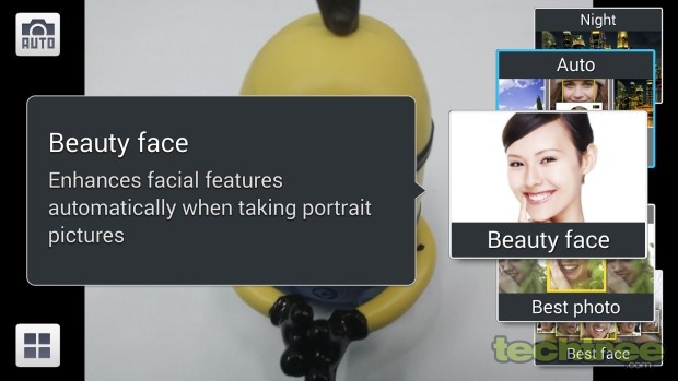
The Note 3's camera is better than its predecessor, both in well-lit and low-light scenarios. So while the camera is quite good, I think that it's a step down from the S4. With Smart Stabilisation in tow, I was expecting better results. Click here, to view the untouched camera sample. Mind you, the photos look brilliant on the Note 3's screen, but when you transfer them to a PC, the glitches are conspicuous.
The Note 3 can record full-HD videos. The clips are saved in MP4 format, and offer smooth playback at 30 fps. You can record slow-motion and time-lapse videos too.
Telephony And Messaging
There are no radical changes in the phonebook. You can swipe a contact to the left to compose a message, whereas swiping it to the right initiates a call. The phone's network reception and quality was great throughout our tests. Besides a large keypad, you can also write a message using the stylus. This may sound too gimmicky, but handwriting recognition works very well on this phone.
Battery
The Note 3 has quite a large 3200 mAh battery. In our 720p video loop test with brightness set to 60%, it lasted for around 13 hours. Considering that the device has a 5.7" screen, the battery performance is excellent.
Verdict
For Rs 45,000, the Note 3 offers an excellent screen with solid multimedia performance. The stylus implementation is nicely done. So in short, if you're fine lugging around a big phone that requires both hands to operate, go ahead and buy the Note 3. It's one of the most powerful, oversized handset you can currently get in India.
On the other hand, considering the phone's 45k price, the phone's interface doesn't feel premium. In fact, it feels cluttered at many places. The design is another aspect where Samsung needs to work on. So if you're not overly finicky about the specs, the LG Optimus G pro is a very good alternative. Priced under 30,000, it's a good Rs 15,000 cheaper too.
Features: 4.5/5
Design And Build Quality: 3/5
Performance: 4.5/5
Value For Money: 3.5/5
Mojo: 3.5/5
Overall Rating: 3.5/5
Specifications:
- 5.7" full-HD Super AMOLED screen (1920x1080).
- 13 Megapixel camera with BSI sensor.
- Samsung Smart Stabilisation, LED flash.
- 2 mp front-facing camera.
- Wi-Fi, Bluetooth 4.0, Infrared, NFC, GPS.
- 32 GB/64 GB internal storage, MicroSD card slot.
- Accelerometer, Gyroscope, Proximity, Barometer, Temperature and Humidity.
- 3200 mAh battery.
- Android 4.3 (Jelly Bean).
- 151 (l) x 79 (w) x 8.3 (d) mm, 168 grams.
TAGS: Mobile Phones, Android, Samsung, GALAXY
- DRIFE Begins Operations in Namma Bengaluru
- Sevenaire launches ‘NEPTUNE’ – 24W Portable Speaker with RGB LED Lights
- Inbase launches ‘Urban Q1 Pro’ TWS Earbuds with Smart Touch control in India
- Airtel announces Rs 6000 cashback on purchase of smartphones from leading brands
- 78% of Indians are saving to spend during the festive season and 72% will splurge on gadgets & electronics
- 5 Tips For Buying A TV This Festive Season
- Facebook launches its largest creator education program in India
- 5 educational tech toys for young and aspiring engineers
- Mid-range smartphones emerge as customer favourites this festive season, reveals Amazon survey
- COLORFUL Launches Onebot M24A1 AIO PC for Professionals


TECHTREE