-
Team TechTree
13:11 13th Oct, 2014
Google Now Is Expected To Get The Material Design Makeover Soon | TechTree.com
Google Now Is Expected To Get The Material Design Makeover Soon
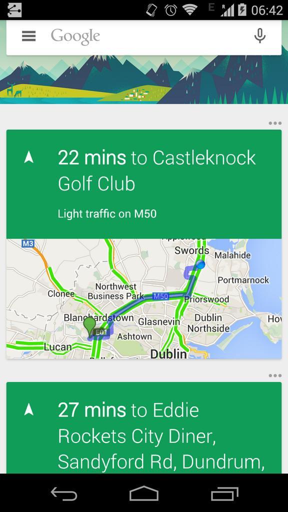
A leaked screenshot of the digital assistant boasts of a beautiful design and a few functionality changes

Google has been updating several of its apps and services, giving them the full Material Design makeover, ahead of the launch of Android L. Next in line to receive an update seems to be Google's digital assistant 'Google Now', as suggested by a leaked screenshot that's been doing rounds on the Internet.
News broke as a Google employee posted a screenshot of the redesigned Google Now app on popular social networking site Twitter, which was deleted soon after. The app now features the characteristic layered design that we're getting used to on apps like Google Chrome, Play Newsstand and other services from the Internet giant.
While the design of Google Now will be thoroughly updated, there will be various functionality changes too. There's now a hamburger menu icon next to the Google logo in the search bar, presumably to access the settings menu. The options button for individual cards also seems to have moved from with the cards to above them.

The leaked screenshot shows the use of a lot of green, but Phanandroid notes that the cards present show traffic information, which is why they could be in green. Other rumours suggest that the app will remain to be predominantly in white, with colors indicating secondary dimensions of the Now cards.
It isn't clear if the company will update its Google Now app before the release of Android L, but given that its other apps and services are being redesigned, we expect the update to come soon. In any case, with the launch of Android L speculated to happen on October 30, it won't be too long either ways.
TAGS: Google, Google Now, Material Design, digital assistant, Android L
- DRIFE Begins Operations in Namma Bengaluru
- Sevenaire launches ‘NEPTUNE’ – 24W Portable Speaker with RGB LED Lights
- Inbase launches ‘Urban Q1 Pro’ TWS Earbuds with Smart Touch control in India
- Airtel announces Rs 6000 cashback on purchase of smartphones from leading brands
- 78% of Indians are saving to spend during the festive season and 72% will splurge on gadgets & electronics
- 5 Tips For Buying A TV This Festive Season
- Facebook launches its largest creator education program in India
- 5 educational tech toys for young and aspiring engineers
- Mid-range smartphones emerge as customer favourites this festive season, reveals Amazon survey
- COLORFUL Launches Onebot M24A1 AIO PC for Professionals


TECHTREE