-
Sheldon Pinto
14:46 18th Aug, 2014
Xiaomi Announces MIUI V6; Looks Pretty Similar To iOS 7 | TechTree.com
Xiaomi Announces MIUI V6; Looks Pretty Similar To iOS 7
Yes, no matter how much you want to argue about it, it does have a striking similarity with Apple’s iOS 7.

Haters are going to hate it, but Xiaomi seems to be the only Android manufacturer pulling off a good-looking customised Android user-experience. We would give HTC some credit here because they are pretty original, but somehow MIUI V6 manages to do what other Android custom skins cannot, keep things consistent.
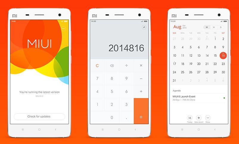
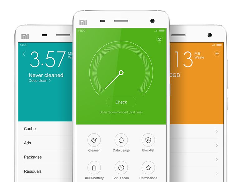
Xiaomi’s MIUI V6 brings to the table a UI that is flat throughout the OS. From the scrolling lists, to the toggles, every icon and app now looks fresher and simpler. There is indeed a lot of wasted space that comes with the new found emptiness, but things indeed look a lot less cramped if you are comparing MIUI with iOS. They have indeed managed to make Android look good through a custom skin; something that Samsung and LG have been struggling with for years.

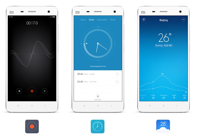
There is also the parallax effect that has found applications in a number of places, the clock being one and the compass the other. If you own a Mi 3 handset, yes, all those beautiful (and crazy) themes will be coming to V6 as well.

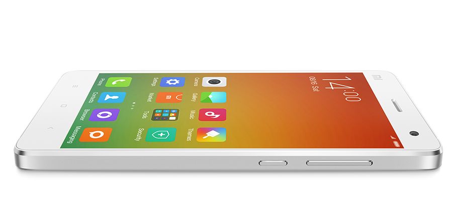
But Xiaomi’s software design team has retained a lot of UI elements from the MIUI V5. The split half white and coloured app interface still remains but has just gotten ‘flatter’. The same goes for the icons, which are completely flat; unlike Apple’s iOS 8 icons which do have slight shadows and gradients.

If you are into flashing Android ROMs, you would know that there are millions of options available, the second you root your Android smartphone. While most of the custom firmwares offer additional customisation, MIUI V5 delivered a slightly polished yet visually consistent UI that looked a lot similar to the iOS 6. There were skeuomorphic influences everywhere and everyone enjoyed it, that is until Apple announced iOS 7 with a flat-happy UI.
The Android world was quick to adapt, and LG and Samsung jumped to a flat UI almost instantaneously with the GALAXY S5 and LG G3. Sony and HTC maintained and simply polished what they had since both skins had have a long history of changes.

All of a sudden MIUI users found the polished looking UI a bit pointless, simply because it simply did not seem “in”. Come the launch of the Mi 4 smartphone last month, and we finally hear that MIUI is moving to version 6 and now we finally have a flatter MIUI. Influenced by Apple? In a way, yes.
TAGS: Mobile Phones, Tablets, Xiaomi, Software
- DRIFE Begins Operations in Namma Bengaluru
- Sevenaire launches ‘NEPTUNE’ – 24W Portable Speaker with RGB LED Lights
- Inbase launches ‘Urban Q1 Pro’ TWS Earbuds with Smart Touch control in India
- Airtel announces Rs 6000 cashback on purchase of smartphones from leading brands
- 78% of Indians are saving to spend during the festive season and 72% will splurge on gadgets & electronics
- 5 Tips For Buying A TV This Festive Season
- Facebook launches its largest creator education program in India
- 5 educational tech toys for young and aspiring engineers
- Mid-range smartphones emerge as customer favourites this festive season, reveals Amazon survey
- COLORFUL Launches Onebot M24A1 AIO PC for Professionals


TECHTREE