-
Alnoor M Peermohamed
13:12 08th Jul, 2014
Apple Rolls Out A Dark Theme For Its Mac OS X Yosemite Preview | TechTree.com
Apple Rolls Out A Dark Theme For Its Mac OS X Yosemite Preview
All the update does is let users turn on 'Dark Mode' that makes certain UI elements darker.

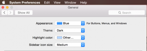
Apple has just rolled out an update for the preview version of OS X 10.10 Yosemite that allows users to turn on 'Dark Mode'. The feature is purely an aesthetic change, with a few UI elements appearing to be darker than the regular theme.
The company previewed 'Dark Mode' back at WWDC in June, but didn't actually turn on the feature until now. The update can be installed by registered developers who currently have the preview version of Apple's latest desktop OS installed on their systems.

Turn on Dark Mode and Mac's persistent menu bar, top bar that appears in each app window and dock background turn darker. That's literally the only change, but as TechCrunch argues it could be a huge benefit as UI elements become less distracting and intrusive.
[See also: Apple Unveils OS X Yosemite: A New Look For The Desktop]
The implementation of this darker theme for the moment don't seem to be complete on the OS X 10.10 Yosemite preview. On the bright (or darker) side the feature has been rolled out for testing purposes and will address the gripe many Mac users have had with overtly bright UI elements when it is rolled out to the public.
TAGS: Apple, OS X Yosemite, Dark Mode, Developer Edition
- DRIFE Begins Operations in Namma Bengaluru
- Sevenaire launches ‘NEPTUNE’ – 24W Portable Speaker with RGB LED Lights
- Inbase launches ‘Urban Q1 Pro’ TWS Earbuds with Smart Touch control in India
- Airtel announces Rs 6000 cashback on purchase of smartphones from leading brands
- 78% of Indians are saving to spend during the festive season and 72% will splurge on gadgets & electronics
- 5 Tips For Buying A TV This Festive Season
- Facebook launches its largest creator education program in India
- 5 educational tech toys for young and aspiring engineers
- Mid-range smartphones emerge as customer favourites this festive season, reveals Amazon survey
- COLORFUL Launches Onebot M24A1 AIO PC for Professionals


TECHTREE