-
Sheldon Pinto
15:10 25th Apr, 2014
Chrome Beta Gets Another Update; Start Page Now Gets A Cleaner, Refreshed Look | TechTree.com
Chrome Beta Gets Another Update; Start Page Now Gets A Cleaner, Refreshed Look
A cleaner and minimalistic design brings the mobile browser closer to the desktop experience.

The last update to Chrome Beta brought a nifty undo feature that allowed users to reopen a previously closed tab. Moreover if you kept clicking on the floating notification, you could undo all the previously closed tabs in the session.
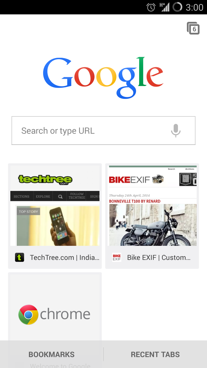
This time around Google has given Chrome Beta’s start page a refresh and it certainly looks good. If you ask us, it now looks a lot similar to the desktop version of the Chrome browser with a leaner look. That lean look comes from the new Google start page which seems to be flatter and minimal compared to the current non-beta Chrome browser.
The Recent Tab’s tiles seem to have gotten bigger in size and instead of appearing in the Recent Tab page now appear on the start screen itself. The bigger previews are certainly more detailed than previous smaller ones as well.

The address bar has disappeared from the start screen and Google now prompts you to click on the search field directly which then expands to the address bar. The tab-switcher now sits isolated at the top right hand corner and appears to float over the start page. Somehow the tab-switcher on the browsing pages sticks to the address bar only.
The Chrome Beta update certainly brings a refreshed look, but certainly promises that there is a lot more coming from Google very soon.
Publisher: Google Inc.
Platforms: Android 4.0 or higher
Size: Varies with device
Price: Free
Download URL: Google Play Store
- DRIFE Begins Operations in Namma Bengaluru
- Sevenaire launches ‘NEPTUNE’ – 24W Portable Speaker with RGB LED Lights
- Inbase launches ‘Urban Q1 Pro’ TWS Earbuds with Smart Touch control in India
- Airtel announces Rs 6000 cashback on purchase of smartphones from leading brands
- 78% of Indians are saving to spend during the festive season and 72% will splurge on gadgets & electronics
- 5 Tips For Buying A TV This Festive Season
- Facebook launches its largest creator education program in India
- 5 educational tech toys for young and aspiring engineers
- Mid-range smartphones emerge as customer favourites this festive season, reveals Amazon survey
- COLORFUL Launches Onebot M24A1 AIO PC for Professionals


TECHTREE