-
Chandrakant 'CK' Isi
19:57 20th Sep, 2013
iOS 6 Vs iOS 7: A Quick Glance | TechTree.com
iOS 6 Vs iOS 7: A Quick Glance
What's strikingly different in the latest version of iOS, and a couple of things that aren't just skin deep.

After announcing it in June, Apple has finally begun the global rollout of iOS 7. As already mentioned in the earlier articles, Apple's mobile platform has gone through a drastic design overhaul. Thanks to Jonathan Ive, the OS now looks flatter and modern than ever (really?). Whether the iOS 7 looks better than the iOS 6 is debatable. However, one thing's for sure that it was about time Apple refreshed the UI. Now if you haven't updated the OS yet, check out this side-by-side comparison between iOS 6 and iOS 7. The screen shots on the left side are of iOS 6, while those on the right... well.
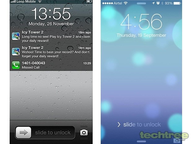
Lock-screen: The iconic slider is finally gone in the latest iteration.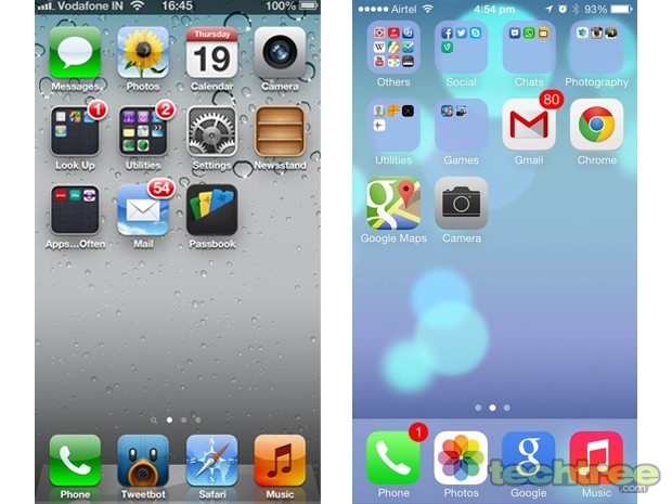
Menu: The glossy bubble icons have made way for the 'flat' ones which seem to lack character.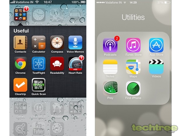
Folder: App folders now look uncluttered.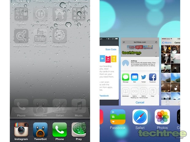
Multitasking: Task switcher makes better use of space in iOS 7.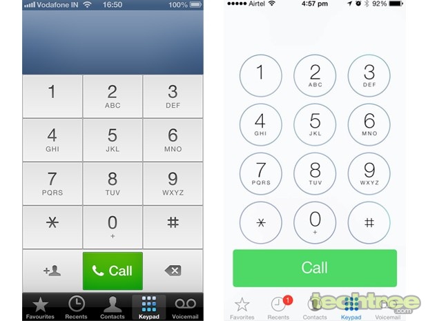
Dialler: Ok, I must say that the iOS 6 dialler looks better here.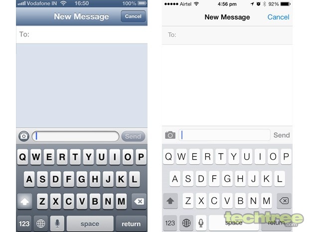
Keypad: The keypad on iOS 7 looks a lot cleaner than its iOS 6 counterpart.
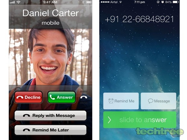
Incoming Calls: Isn't something missing there? Yes, there is no on-screen button to decline incoming calls!
With iOS 7 you can answer a call, or decline it but not without stating a reason through a message. Strangely, the 'Decline' option is not available when the screen is locked. However, it's available when the screen isn't locked. Bizarre! But worry not, for now you can decline a call by clicking the power button twice.
Apart from the cosmetic changes, here are some new features that have been added to iOS 7:
iTunes Radio
This new internet radio service from Apple lets you find and stream your favourite music. Think of it as TuneIn radio, but with a better interface. However, we couldn't test this feature as it's only US exclusive at the moment.
Control Centre
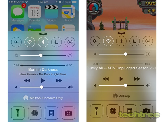
This feature provides a quick access to Wi-Fi, Bluetooth, offline mode toggles. You can also lock your screen’s orientation, adjust brightness, access torch, and Airdrop without entering settings menu. To bring up the Control Centre, simply swipe up from the bottom bezel. It’s certainly a good addition, but you better disable it while playing Temple Run.
AirDrop
Usually, you would require WhatsApp or Email to share an image or document with another iPhone. Not anymore, as AirDrop quickly lets you send and receive certain flies and contacts using your iPhone’s Wi-Fi and Bluetooth. That’s a welcome addition, but sharing it with Android and Windows Phone devices is still a no go.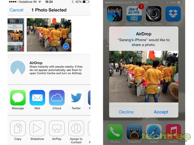
Spotlight Search
Apple has slightly tweaked the way we access the search bar. This has made quite a few users fumble because you can no longer access the search bar by swiping left of the homescreen. For those not in the know, you’re now required to touch and pull-down homescreen to bring up the Spotlight search.
Coming to the subject of performance, the OS runs as smooth as its predecessor on the iPhone 5 and 4S. However, the iPhone 4 suffers from consistent stutter after the update. So those stuck with three generations old iPhone should think twice before installing the new OS.
If you still haven't made up your mind about the new firmware, check out this iOS 7 introduction video by Sir Jonathan Ive. I'm sure, he'll convince you to update the software.
TAGS: Mobile Phones, Apple, iPhone
- DRIFE Begins Operations in Namma Bengaluru
- Sevenaire launches ‘NEPTUNE’ – 24W Portable Speaker with RGB LED Lights
- Inbase launches ‘Urban Q1 Pro’ TWS Earbuds with Smart Touch control in India
- Airtel announces Rs 6000 cashback on purchase of smartphones from leading brands
- 78% of Indians are saving to spend during the festive season and 72% will splurge on gadgets & electronics
- 5 Tips For Buying A TV This Festive Season
- Facebook launches its largest creator education program in India
- 5 educational tech toys for young and aspiring engineers
- Mid-range smartphones emerge as customer favourites this festive season, reveals Amazon survey
- COLORFUL Launches Onebot M24A1 AIO PC for Professionals


TECHTREE