-
Rahul R
14:45 22nd May, 2013
Google+ Mobile Announces Redesign To Keep Pace With Desktop Experience | TechTree.com
Google+ Mobile Announces Redesign To Keep Pace With Desktop Experience
A new look for user profile pages is in the offing now, in a post-Google I/O development.

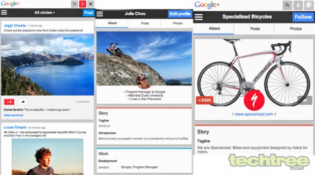
Google which updated its Google+ webpage for desktop browsers with enhancements to its Stream, Hangouts and Photos sections, has announced an update to Google+ webpage for mobile browsers as well. This update is in line with Google's service revamps at the recently concluded I/O developers conference. The most important enhancement in Google+ mobile is the mechanism by which photos, posts, links are converted to "cards". This "conversion" is said to provide for easy readability and resharing of posts on Google+.
The other change in the mobile Google+ site is a redesign of profile pages, for individual users as well as brands. The redesign includes cover photos and larger tap targets (target pages appear big in order to enable easy tapping on a touchscreen).
These enhancements no doubt add a certain amount of functionality to Google+, but they are yet to come close to the Android and iOS mobile application versions of Google+, in terms of user interface. For instance, Google+ for mobile doesn't incorporate functionality such as Hangouts and communities. However, the Google+ iOS app is yet to be updated, and there is only a remote possibility that it will incorporate these aspects. As of now, Google+ offers a similar experience on desktop and mobile.

Screenshot of the new look Google+ mobile.
- DRIFE Begins Operations in Namma Bengaluru
- Sevenaire launches ‘NEPTUNE’ – 24W Portable Speaker with RGB LED Lights
- Inbase launches ‘Urban Q1 Pro’ TWS Earbuds with Smart Touch control in India
- Airtel announces Rs 6000 cashback on purchase of smartphones from leading brands
- 78% of Indians are saving to spend during the festive season and 72% will splurge on gadgets & electronics
- 5 Tips For Buying A TV This Festive Season
- Facebook launches its largest creator education program in India
- 5 educational tech toys for young and aspiring engineers
- Mid-range smartphones emerge as customer favourites this festive season, reveals Amazon survey
- COLORFUL Launches Onebot M24A1 AIO PC for Professionals


TECHTREE