-
Team TechTree
09:18 25th Jan, 2020
Hey Google! Your New SERP Design is Not Okay | TechTree.com
Hey Google! Your New SERP Design is Not Okay
Looks like the search giant has slipped in a subtle change on the SERP that makes it tough to distinguish what’s an ad and what’s not

What does a 900-pound gorilla straddling the search space do when ad revenues hit a plateau? They simply alter the design of the search results page in such a fashion that one finds it tough to figure out what’s an and what’s not, thus relying on user ignorance or lethargy to keep the dollars rolling in.
And what about the customers getting wrong results? Who the f*$* cares? So long as money is there to be made, customer experience can take a hike. At least till such time that some regulatory agency comes a calling and penalizes a company that’s already fought and lost several legal battles.
So, what’s the latest change all about? It can be described in two simple sentences and that’s what you would find right below:
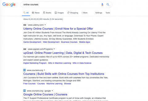
- The desktop search page design got changed around January 13-14 and the rollout is happening as you read this. A major change – inclusion of favicons next to search results.
- The next subtle change came about where Ads and organic search results appear similar in layout with a minor difference. Ads have the word ‘Ad’ as favicon while others have their logos

And how does this help? Quite simply, users who aren’t on the money or as discerning as one needs to be while on the internet, mistakenly clicks on the ads and Google pockets the cash. Doesn’t matter that the user shuts down the page or hits back button? They’ve still clicked on the link and based upon the cost of the AdWords our gorilla gets the money.
Just in case you’re wondering if all of this could just be the figment of schizophrenic, here’s an update. Early Analysis conducted by NordicClick.com reveals that desk-top clickthrough rates increased between four and 10.5 percent, which for the same searches on mobile phones, there was a decline in the same clickthrough rates, says Digiday.com, which has been tracking these changes.
By the way, this isn’t the first time Google has redesigned the SERP (search engine results page). In May last year, Google search on mobile devices included favicons, which Google described as part of its effort to “help users better understand where the information is coming from and what pages have what they’re looking for.”

The latest change is just to ensure same user experience across devices, says the company in a Tweet which says, “Last year, our search results on mobile gained a new look. That’s now rolling out to desktop results this week, presenting site domain names and brand icons prominently, along with a bolded “Ad” label for ads.”
All good? Not exactly. At first glance, the tweet makes it appear that organic search results became easier to spot but the reality is exactly the opposite. In fact, that’s precisely what Google appears to be saying so – that the visual distinction has been flattened between organic results and the ads that Google monetizes so effectively.
Digiday.com quotes SEO Consultant Bill Hartzer to suggest that Google is using the concept of banner blindness here. Since now both organic search and ads have favicons of similar sizes it is more likely that searchers will overlook them both and merely click on the first available link, which of course, just happens to be a monetizable one.
So, why has Google come up with this deceitful plan? Quite simply due to the fact that its click volumes, while showing a jump of 18% year-on-year in the third quarter of 2019, has been slowing down over the past three quarters. The company’s revenues of $40.3 billion in Q3 of 2019 was up from $38.8 billion in the preceding quarter, with ad revenues at $33.9 billion.
Just proves that even in a day and age where UI/UX define the web, Google is ready to face the flak when it comes to making that extra few billions. And this time round, it has hit bullseye because the visual trick would be less confusing on small screens but on desktops the favicons are minute enough to make users click on them by mistake.
So, with just a favicon differentiating an ad from what is an organic result, Google is sitting on a virtual lottery ticket that could boost revenues over the next few quarters.
Unless the users learn to squint more effectively while searching on Google!
- DRIFE Begins Operations in Namma Bengaluru
- Sevenaire launches ‘NEPTUNE’ – 24W Portable Speaker with RGB LED Lights
- Inbase launches ‘Urban Q1 Pro’ TWS Earbuds with Smart Touch control in India
- Airtel announces Rs 6000 cashback on purchase of smartphones from leading brands
- 78% of Indians are saving to spend during the festive season and 72% will splurge on gadgets & electronics
- 5 Tips For Buying A TV This Festive Season
- Facebook launches its largest creator education program in India
- 5 educational tech toys for young and aspiring engineers
- Mid-range smartphones emerge as customer favourites this festive season, reveals Amazon survey
- COLORFUL Launches Onebot M24A1 AIO PC for Professionals


TECHTREE