-
Sheldon Pinto
28th Jul 2015
Seems like the OnePlus 2 really turned out to be a hit. New features and hardware bits aside, everyone knows that it is the pricing of this smartphone, that will become a major problem for brands like Sony, Samsung, HTC and LG. Clearly, this is not the rudimentary first effort, but a well-planned and engineered one, that seems to have already made a lasting impression on many.
The low price tags aside, the Chinese smartphone maker is pretty serious about bringing something new. But there is indeed very little that can be achieved when you are locked down to the Android source code that currently supports so little. The fingerprint reader for example has a very limited use (currently) and at best, will be used to unlock the smartphone. And that is about it.
But there are a few moves that we liked and they are as follows:
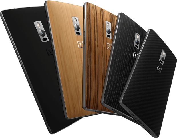
Firstly, there is that design. One that reminds us of the OnePlus One, the original flagship killer. One look at the back and one clearly would not be able to tell the difference until you look closely and notice the laser autofocus assist module. On the front things have changed and the aluminium frame does add premium look compared to the One.

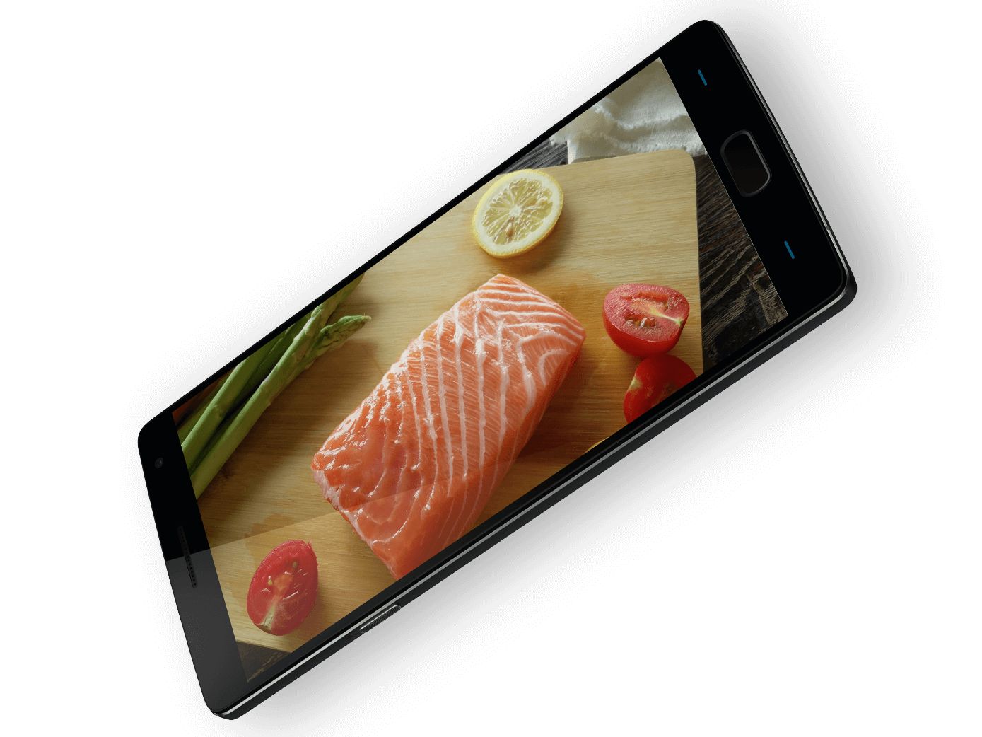
OnePlus made a smart move by sticking to a Full HD 1080p display. Indeed, its hard to tell the difference between a Quad HD (2560 x 1440 pixels) and Full HD one, but OnePlus is going to save up on its bigger battery and deliver better graphics since most apps an games are don’t even go native on Full HD displays, forget about Quad HD ones.
Let’s face it, the original OnePlus One’s camera was not all that great. It would appeal to someone coming from a mid-range handset, but up against the iPhones and Samsung’s Galaxy devices it was nothing much to talk about.
This time around, we have down to earth 13 MP unit that not only comes with OIS but also with laser assisted autofocus. So for now, at least on paper (and from the samples), things do look good.

StyleSwap covers finally arrive on the OnePlus one. This time however, they are a lot easier to install but it makes the handset look a lot like a Moto X.

What we really liked, is the mechanical 3 position switch. One that seems inspired from the iPhone and will let you juggle between 3 profiles, (all, priority and none) instead of doing all of that tapping, the standard Android way.
Yes, we did dislike a few things about the OnePlus 2 and its not the lack of SD card slot:
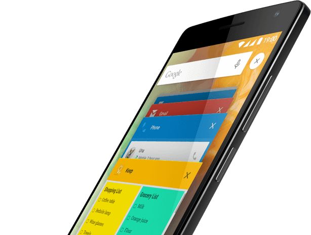
The Shelf feature for example seems out of place. We would prefer if the Google Now cards shows up out there. More importantly, Shelf tries to be useful, but it needs extended functionality in the form of added plugins, which third-party apps will need to support. So its functionality will be limited at best, with just recently used contacts and apps.

We have noticed the OnePlus 2’s display. And while we are happy that the company went in for one with a 1080 pixel resolution, it does not sit flush inside the aluminium frame. This is a case similar to that of the Motorola Moto X and the Nexus 6, two smartphones that have been plagued with damaged displays thanks to a similar design trait.
All in all we did like the new OnePlus 2 and it will create problems for handsets like the Xiaomi Mi Note Pro that are expected in the fourth quarter. As for the rest of the international smartphone brands, their fate will be decided once the 2 starts rolling out from the 11th of August.
[Also Read: Should You Upgrade To The OnePlus 2?]
What We Like And Dislike About The OnePlus 2 | TechTree.com
What We Like And Dislike About The OnePlus 2
While some of the features are innovative, others clearly aren’t.
News Corner
- DRIFE Begins Operations in Namma Bengaluru
- Sevenaire launches ‘NEPTUNE’ – 24W Portable Speaker with RGB LED Lights
- Inbase launches ‘Urban Q1 Pro’ TWS Earbuds with Smart Touch control in India
- Airtel announces Rs 6000 cashback on purchase of smartphones from leading brands
- 78% of Indians are saving to spend during the festive season and 72% will splurge on gadgets & electronics
- 5 Tips For Buying A TV This Festive Season
- Facebook launches its largest creator education program in India
- 5 educational tech toys for young and aspiring engineers
- Mid-range smartphones emerge as customer favourites this festive season, reveals Amazon survey
- COLORFUL Launches Onebot M24A1 AIO PC for Professionals


TECHTREE