-
Chandrakant 'CK' Isi
17th Feb 2015
We all know Microsoft's big plan to unify phones, tablets, and desktops with Windows 10. According to the software-giant, the new software will deliver consistent user experience across variety of screen sizes. To tease us with the glimpse of the future update, Microsoft rolled out the Windows 10 Preview a few days ago. I have this latest software loaded on the Lumia 830, while the Lumia 730, running Windows Phone Denim, comes in handy for comparison. After using Windows 10 for a few days, here's my take on the new operating system. Keep in mind that this article is based on the early test build of Windows 10. Microsoft clearly states that the software is work in progress, and some of the features might not make it to the final build.
New Homescreen
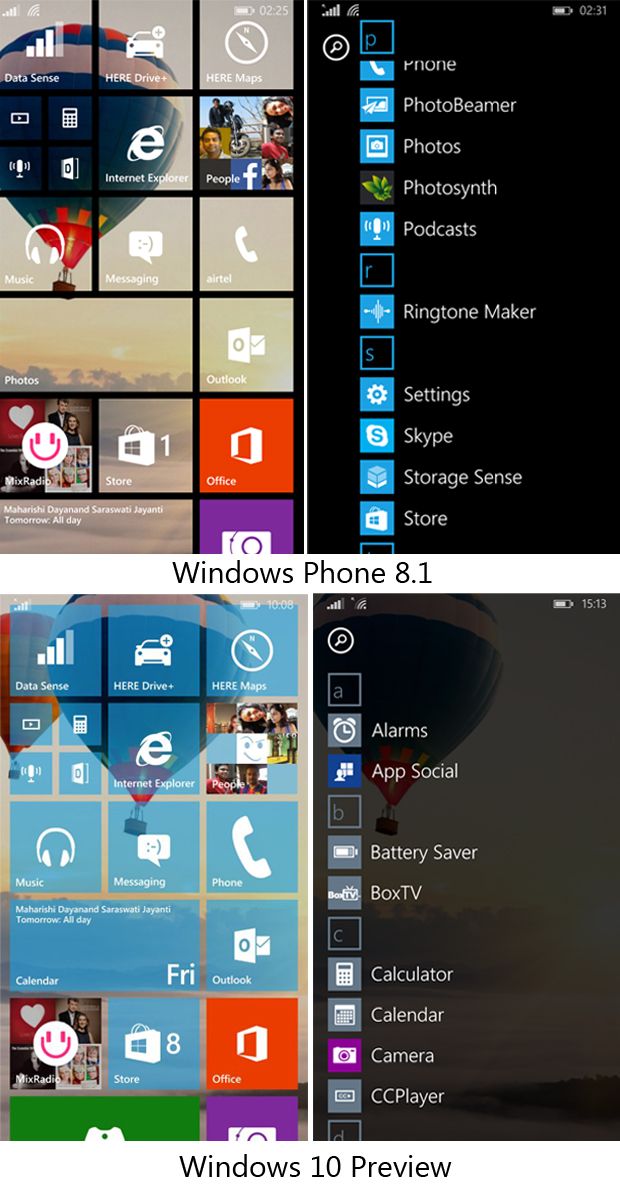
The biggest visible change in the Windows 10 on phone is the homscreen, which now supports a full-size wallpaper. In Windows Phone 8.1, the wallpaper is only visible through transparent tiles. I prefer how the wallpaper slides under the tiles in 8.1. A full sized wallpaper and floating icons in Windows 10 feel like vertically scrolling Android OS. Let's hope Microsoft retains the good-old wallpaper option in Windows 10.A good addition here is that the wallpaper now extends to the app list. This is nice touch that brings design consistency between the home and app list.

Streamlined Settings
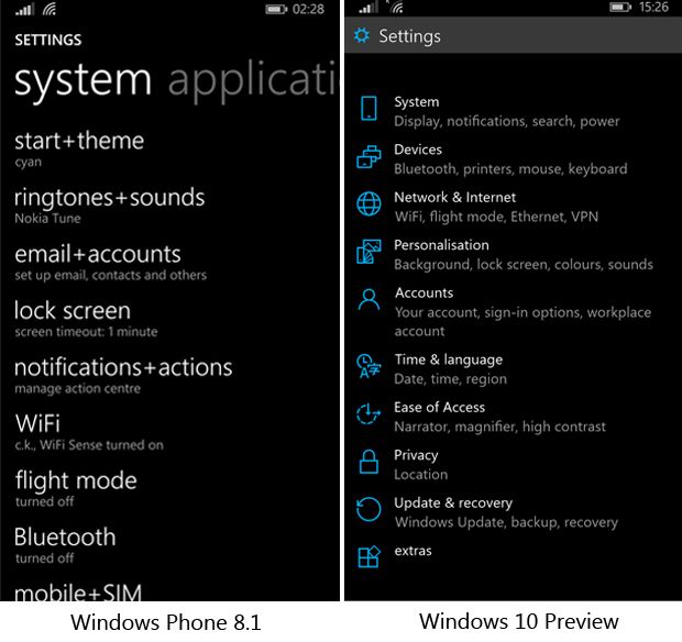
As mentioned in our, 'Things That Suck About Windows Phone' article, Windows Phone up to Windows 8.1 features a confusingly long list of Settings. it includes around 42 random options including Start+Theme, Ringtones+Sound, Email+Accounts, Internet Sharing, Lock Screen, Notifications+Actions, Wi-Fi, and Airplane mode. Thankfully, Microsoft has addressed this issue in Windows 10. The new software features an organised list with neat iconography.
Keyboard Joystick
Remember that red pointing stick on IBM laptops? Well, Microsoft has implemented a soft joystick in its keyboard. This makes editing text a lot easier. I'm sure many will agree that getting the cursor at the right place using your finger feels like performing a virtual surgery.
Functional Action Center
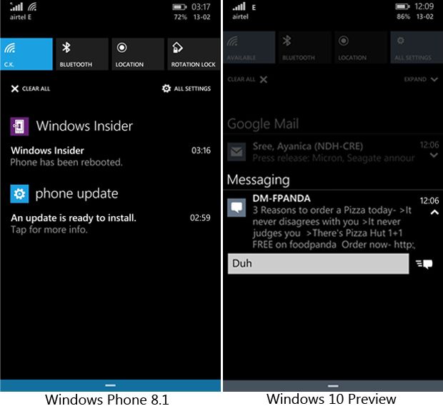
Taking cue from Android and iOS, Microsoft has added new tricks to the Action Center. For starters, you can now swipe away a single notification (not possible in Windows Phone 8.1). The notifications feature a small clickable arrows that sheds more light on the notification. If it's a message, it provides you with the option to type-in a reply right from there. Definitely not a killer feature, but it does help you save a few seconds.
Inconsistent User Experience
Bit-by-bit, Microsoft's mobile platform is losing its elegance. First, the brilliantly done panoramic app interface was let go. And now, it seems to have come to a point, where Microsoft is not even bothered to keep the interface consistency. The option panels, triggered by press and hold action, look cluttered like Android. A few apps such as Photos and Calculator, Microsoft has lifted Android's burger menu (navigation drawer), which entirely goes against Microsoft's design philosophy. Joe Belfiore, you better get rid of this inconsistency in the final build. As an end user, I appreciate new features. But, let's not compromise on the user experience, because that has been the only strong point of Microsoft's mobile platform so far.
Windows 10 Preview For Phones: The Good, The Bad, And The Ugly | TechTree.com
Windows 10 Preview For Phones: The Good, The Bad, And The Ugly
A quick look at Microsoft's upcoming operating system.
News Corner
- DRIFE Begins Operations in Namma Bengaluru
- Sevenaire launches ‘NEPTUNE’ – 24W Portable Speaker with RGB LED Lights
- Inbase launches ‘Urban Q1 Pro’ TWS Earbuds with Smart Touch control in India
- Airtel announces Rs 6000 cashback on purchase of smartphones from leading brands
- 78% of Indians are saving to spend during the festive season and 72% will splurge on gadgets & electronics
- 5 Tips For Buying A TV This Festive Season
- Facebook launches its largest creator education program in India
- 5 educational tech toys for young and aspiring engineers
- Mid-range smartphones emerge as customer favourites this festive season, reveals Amazon survey
- COLORFUL Launches Onebot M24A1 AIO PC for Professionals


TECHTREE