-
Madana Prathap
04th Feb 2013
Basic office productivity software has become a commodity. Between existing freeware productivity applications, a dozen forks of OpenOffice and Google Docs, the user has a plethora of free alternatives to the Microsoft Office suite, and they all get the basic features right, give or take a couple. For vast swathes of commercial paying users and even home users, all that the newest office suite has to offer is familiarity with the name.
Relevance of a new version has fallen, possibly because it became a victim of its own success. The ancient Office '97 can still do everything that basic users ask for. A decade after Office '97 was launched, Microsoft had to overhaul the interface entirely with the Ribbon UI in Office 2007, to force some freshness. If compatibility with newer OS versions is the main reason for Office suite upgrades, and not features, something is very wrong. But that's for another discussion on another day.
Apart from the larger point made above, here are some annoyances that I have observed with MS Office 2013 which launched last week :
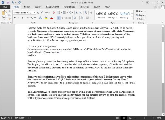
1. STOP SHOUTING AT ME MICROSOFT! All the Ribbon tabs have titles that are rendered in ALL-CAPITALS. It gets really distracting for a lot of people I know, who have had to make a hack and render the titles in normal "Title Case" as it used to be in previous versions of the suite.
Notice the first row, which is the title row for each Ribbon tab.
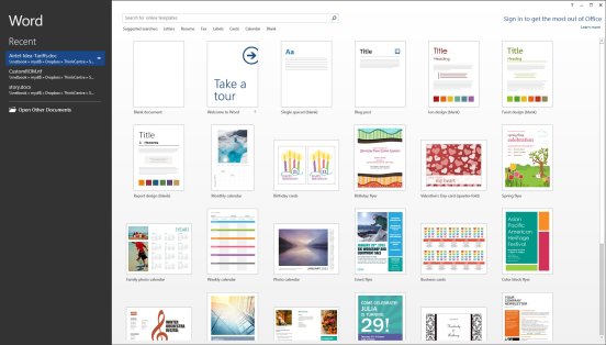
2. Start Page has taken over all applications, leaving you fumbling when an application is launched. Sure, in many apps in the suite, a lot can be done from Start Page. Except that you cannot figure out (intuitively, at least) how to actually begin with your task, thus inserting a break into your work flow. So Microsoft is telling me, I won't directly get to begin typing a document when I launch Word, or start entering data into cells when I click on Excel, from the Start Menu. In another industry, that might have been called a speed-breaker.
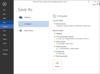
3. Default Save location is Skydrive. Looks like someone at Microsoft thought local storage is dead. Guess what? PCs still come with internal storage, and people are still buying hard disks. How many of you would actually save directly to an online storage account, rather than first to your hard disk? Not me, for sure.
Moreover, the "Save As" dialog box isn't readily available to enter the file name and file-format. Cloud and online integration is very well, but this will not fly for business users until enterprise IT reworks data security guidelines.
4. Requests to save an opened file even when no changes have been made, have not been fixed. Small issue, you say? Well imagine this: I open a file only to view, leave it open for two hours, then I return to the document and click the close button. When I see such a warning I wonder, did I accidentally make any edits, have I accidentally overwritten some important data?
It confuses me, utilizes memory/thought to decide which button to click and generally wastes my time.
No Microsoft, I made no changes as far as I know. Don't you dare lose my data, let me go back and check just in case!
5. Office 2013 feels unchanged, so why buy it? (ok, this one is not an annoyance, per se, but read along, and you'll know what am saying)
If I forget for a few minutes that I'm using the new version, it looks much like its predecessor, in terms of features and interface. Unfortunately even the argument of a consistent interface can't be used, with all those tiny interface changes everywhere that seem forced and unnatural. The Ribbon UI still hides features from experienced users, is hard to use with a touch screen tablet even in touch mode, and those familiar with the old menus still find even basic functions hard to relearn without losing productivity.
6. Pricing of editions has been increased, for the lower versions. The Home & Student version now costs double at retail, compared to Office 2010. Well, I have not factored inflation here; in any case, software development does not work the same way as traditional manufacturing does, cost wise.
The new option for budget users is Office 365 where you subscribe and pay every year (which itself ends up being more costly).Side notes:
While the number of retail in-box editions have been simplified, application combos still don't have the entire selection, with Visio, Project and SharePoint Designer being excluded. These have to be bought separately, with no discounts available, no matter which version and how many licenses of Office 2013 you buy.
With this version, the last resort for OEMs to give the suite pre-installed on PCs has been knocked away. MS Office Starter Edition does not exist anymore. Even the heavily discounted price Microsoft levied on OEMs to bundle the old Microsoft Works suite was not enough to make up for the restrictions that the software had, leading to it being discontinued with the previous version's release. Most alternatives are free, why are we still paying for Office and making it a cash cow for Microsoft?
Why I Think Microsoft Office 2013 Gets It Wrong | TechTree.com
Why I Think Microsoft Office 2013 Gets It Wrong
In addition to existing problems, this version of the productivity suite introduces its own annoyances.
News Corner
- DRIFE Begins Operations in Namma Bengaluru
- Sevenaire launches ‘NEPTUNE’ – 24W Portable Speaker with RGB LED Lights
- Inbase launches ‘Urban Q1 Pro’ TWS Earbuds with Smart Touch control in India
- Airtel announces Rs 6000 cashback on purchase of smartphones from leading brands
- 78% of Indians are saving to spend during the festive season and 72% will splurge on gadgets & electronics
- 5 Tips For Buying A TV This Festive Season
- Facebook launches its largest creator education program in India
- 5 educational tech toys for young and aspiring engineers
- Mid-range smartphones emerge as customer favourites this festive season, reveals Amazon survey
- COLORFUL Launches Onebot M24A1 AIO PC for Professionals


Reader Comments (11)